Introduction
Creating my website was one of the most exciting things I have done for my coursework thus far. It is a form of outlet for letting loose your creativity and creating something that will impact others. It is not only just to store my coursework and show my knowledge and understanding in the area, but it also allows me further understand what it takes to create and manage a website.
Although I will not be using it to sell my services or products, it will give me insight into how analytics works and how to create an accessible design for people with different disabilities. I had a brief given to me on an outline of what needed to be in the website, but I could also expand on what was included to adapt the website to my own. The menus on the website needed to include: a home page, about, certificates, portfolio and blog page. The plug-in that our tutor recommended that we use was Astra, which provides templates that you can edit and mould into your own.
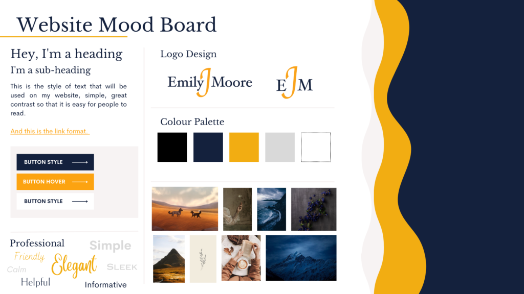
After I was confident with the template that I had chosen, I added my pages and began planning how I wanted to display my work. (More information below). I also created a Mood Board to give me an idea of the general aesthetic of my site.
Colour Palette
The first step was deciding what colours I wanted to use for my website, and in the end, after much deliberation, I chose to stick with the colours that I originally chose for my CV and portfolio. When I first created my CV, I knew the colours that I would choose would be extremely important in attracting potential employers. To make sure that my colours would work and be appropriate for people with colourblindness, I used a site called Coolors.com. They have a choose a palette option which allows you to generate a complementary palette.
The 4 colours that I chose were: navy, gold, grey and white. I wanted it to be professional, but not boring, so the gold colour helps brighten up and highlight my CV. But I didn’t choose these colours randomly, they all have a purpose and a meaning behind them. I wanted my colours to be able to give a feel of how I was as a person in both a professional setting and in the workplace, I’m reliable and trustworthy, and I always like to get on with my work.
Navy: trust and stability
Gold/dark tangerine: energy, youth and happiness
Grey: neutrality and balance
White: simplicity, pureness and cleanliness.
Pages and Menus
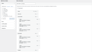
Once I was happy with my plan, I started to create the pages that I needed first in order to complete the assessment before then moving on to additional pages that express my creative side allowing me to then progress into creative marketing. Creative a new menu is simple, all you need to do is create a new page under the ‘Pages’ on the sidebar of the WordPress dashboard, and that created page will show up as an option to add to your menu. You can then select and select ‘Add to Menu’ which will bring it up on the menu list. You can keep it as the header, or you can put it under the other as a sub as shown below.
One of the first problems that I first encountered was that when you hover over one of the main menus, it brings up a white box drop-down. All of the sub-menus were in white, so it was impossible to see the options. After finding no alternative option in WordPress, I found a piece of code that I could use and alter so that the sub-menu text would be in my yellow colour. This code is: <span style=”color:#fca311;”>Blogs</span>
The first part of the code is the <span> tag, it is an inline container that is used to edit a line or a part of your content. It is important in code that when you start a piece of code like <span>, (even if it’s in <head>/<body> etc.) that when you have finished the line of code and content you add a slash like this: </span> so the processor knows that you intend to end that edit, otherwise it will not be recognised as valid.
Originally, the code only changed the highlight option, so the text would only have a yellow background. But after having a quick conversation with my older brother who codes, he told me that I only needed to change ‘background’ to ‘color’, and that would allow only the text itself to change colour.
Adding Elements
Adding buttons is also really simple to create. You add a button element from the page edit menu and then you can link it to a page by going to the general section on the right-hand side of the page editor and past it into the ‘link’ box. I also learnt that you can add an element which allows you to have a picture alongside text. You can change its layout too, whether you want the photo on the left or right side.
You also don’t need to worry about how it would be managed and viewed on mobile because it will automatically put the media on top and the text on the bottom, this can also be changed in the settings. One of the elements I love the most is the ‘compare images’ which allows you to upload two images and a slider will separate them so that when you move the slider you can view the differences (an example of this can be found in my Changing website images blog).
The Plug-ins I used
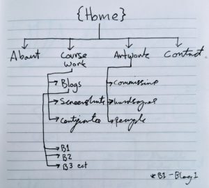
During one of our webinars in learning how to create a website, we got introduced to a plug-in called Astra, which allows you to use their templates so that you can focus on the content of your new site. After browsing through some, I found the one that was closest to how I wanted to display my content. On paper, I designed what I wanted the layout to look like and where I would place buttons so that it is easy for people to navigate through my website. As a precaution, I use UpdraftPlus to back up my content on my website, in case I make an error or the files become corrupted, so I can restore a previous version.
Analytics
For analytics, I added three different ones so that I could see how both compare when analysing the data from my website, they are Google Site Kit, Moster insights and Jetpack. You can use Google Analytics to see if your site is perforin the way you intended and see which pages are doing better than others including the different conversions your site could have made.
Cookies
For Cookies Consent, I used a plug-in called CookieYes Cookie Consent that allows your website to be GDPR compliant by adding a cookie banner to your website. It also supports compliance with Brazel, France and California.
Accessibility
To help my site be accessible, I use WP Accessibility which helps with a variety of different accessibility problems that people may come across because of the WordPress theme I use. It adds; skip links with user-defined targets, an outline to the keyboard focus state for elements, labels to the standard WordPress form fields and more.
We were also introduced to the Wordfence for WordPress plug-in that gives you a layer of protection on your site from different threats throughout the web, such as attacks and spam. It lets you know when there are possible vulnerabilities in your website and even how many attacks it has helped blocked.
JetPack, like Wordfence, add that extra layer of protection to my site. It also backs up my site as well like UpdraftPlus but it also gives an activity log, maintenance and troubleshooting. It also works to block any spam comments and form responses and anti-spam features that are powered by Akismet (which is another plug-in that I downloaded).
To help protect my images and my content from being copied and used, I have downloaded a plug-in called WP-Copyright-protection. This is so people cannot steal my information easily and helps to add another layer of protection.
Making sure my website is accessible
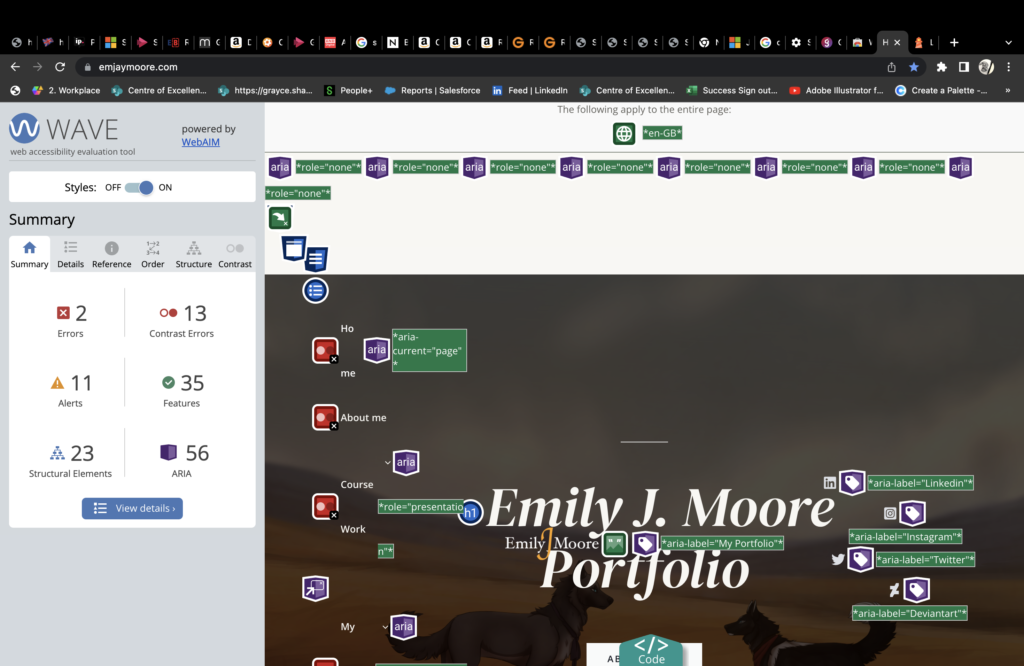
To check the accessibility of my website, I used Wave and Lighthouse on Google Chrome. These tools allow you to see where there are possible problems people could have when visiting your site. This allowed me to see where users may experience some difficulties when using my site, like with contrast levels. Something that came up as a possible issue on Wave was the contrast levels of the menu bar at the top being low contrast with the overlaid image. With Lighthouse, I got a detailed report on my website including the performance levels.
Lighthouse
The lowest scoring part was the performance which was 54/100, with the rest being above 93. This was due to the indexing speed, total blocking time and load image time. This can be fixed by shrinking the image sizes and doing a few additional things such as:
- Using the correct image sizes to decrease load time
- Reducing unused JavaScript and CSS (plug-ins may be affecting this)
- Clearing Cache
- Reducing the storage size of images
According to Lighthouse, I also need to make some minor accessibility improvements. It brought up the colour contrast of the yellow and white buttons on the Cookie pop-up, one of my heading elements was not in sequentially descending order and an image had no discernible name. Then the only SEO issues it brought up were a few links that had no descriptive text.


Wave
I went through my Wave report on the home page and there were a few issues that it brought up. All easy, quick fixes help to massively improve my site and its accessibility for others.
- Missing alternative text on a couple of images
- 7 contrast errors – low contrast with text (mainly the menu bar)
- Links that look suspicious (buttons)
- Redundant links
- Possible heading
UX/UI
UX (User Experience) and UI (User Interface) are always important to keep in mind when creating any site or even publishing on social media. They are both connected and are essential to any website if you want to keep up steady traffic and have a generally efficient site that people will enjoy using. Although I don’t promote or sell a service/product on my site, I still have to be aware of both so that my website will be efficient to use and so that I can help my company’s website grow. UX is the physical and digital products with a focus on a user’s full experience and creates a structural design that leads to effectiveness. UI on the other hand focus on the digital product only and the visual aspects of the product, typography, colour and imagery are included in this. By attaining great UI, you produce an aesthetically pleasing user interface. These had a hand in why I chose the aesthetic for my website, providing users with a professional and soothing site with a palette, and a well-structured and easily navigated site.
How I chose my images
When I first put my initial mood board together, I knew that I wanted it to be in line with the palette I chose and be complimentary to my website. So I went through my illustrations to pull up for the headers to make the user experience more interesting, visually appealing and relaxing. Adding images helps to engage users with your site, if you just had text throughout your website, no one would stay very long and in this day and age, people can easily lose interest. Even in my blogs, I have tried to add images that make sense and also coincide with the subject matter, adding to the content and not just being there for the sake of it. Using media should add to the value and not detract from it.
