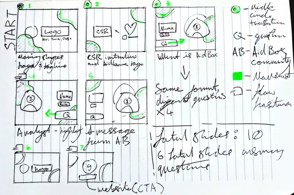
I began with the brief of the video which was to showcase a case study with one of our charity partners, Aid Box Community, with the founder Imogen Mcintosh speaking about what Grayce Analysts did for her charity, including one of the Analysts who worked on the project and how she felt while working on it. The CTA would simply be our website and the beginning and ending slides needed to be similar.
To begin with storyboarding, I drew out the beginning boxes and used a green gel pen to highlight what would move in each scene. We wanted the video to be consistent throughout, so the layout for the questions didn’t change, instead, I moved the focus to the opposite side of the page where we would insert our Analyst comment. This helps to keep the attention of the viewers by adding visual interest.

I also made a key on the side of the page to note the different abbreviations and symbols I used for ease of use.
Here is the finished video: