The first actual big project that I received was to renew the photos that were on Grayce’s website. This came as part of a whole website update where we changed up the navigation bar to be simpler and we simplified the pages. We recognised that our bounce rate was above the minimum recommended bounce rate (20-40%), so we knew that we would have to do something if we wanted to attract more clients and potential hires. Before the big changes were made, I got my brief, which was essentially to renew a lot of the old photos of people that were either no longer employed, had old lanyards or had drinks/food in the pictures.
When I went through the website, I took note of some of the things that would definitely need to be changed in order to make sure that our website was accessible to everyone. So after taking a few notes, I put together a PowerPoint highlighting the lack of contrast in colours, like the grey on white which for me especially is quite difficult to read, and I also mentioned what colours we should avoid putting together because some people with certain types of colour blindness may not be able to see or read what we have put on our website.
Updating a website is a very important part of our jobs in the marketing team. Not only is it useful to keep potential hires and clients informed about what we are doing as a company, but it also allows us to learn and adapt our website for different users with different needs. Whether it is a disability or if they are using different devices. So it was important for us as my team edited the website, that we use as many different devices as possible so that we could see if everything that we added and changed worked.
After the written and technical were updated on the website, I knew that I needed a concise plan if I was going to change the images in a timely and efficient manner. I went through each page and took note of every photo that would need changing. This is so that when I came to change them, I wouldn’t end up putting too many duplicates while also making sure I chose images that would fit the theme of the content of the page. The brief mentioned that I wasn’t to touch headshots of people and blog posts, since that isn’t the defined area that I was editing. After I was happy with my list, my manager taught me how to change the images on WordPress (frontend editor), including the photos in the banners.
To change a photo in the banner, you have to first go into the page as an editor and click on the following:
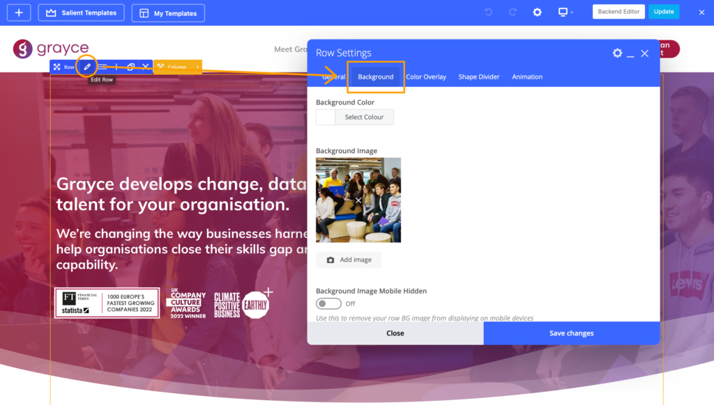
Once you click through to the background, you will be able to upload a new image or pick another from your Media. For this main image, I had to go into photoshop in order to edit out the bear bottles and food packet. It was a bit of a learning curve at first, but when you practice and do it a few times, you start to get more efficient at it.
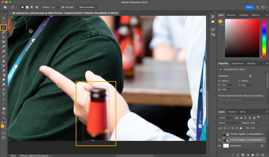
To remove an item from an image in photoshop, first, you have to insert your image and unlock it at the layers sidebar. Then with the lasso tool, you surround the object that you want to hide.
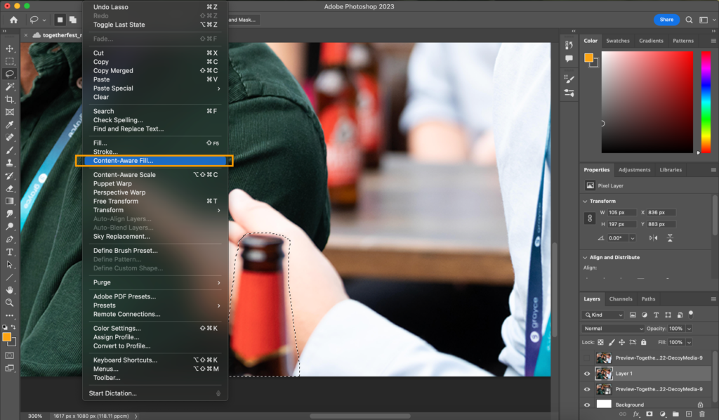
Once you are happy, you want to go into ‘Edit’ and click on ‘Content Aware Fill’.
Then you have to use the brush tool to highlight where you want Photoshop to reference.
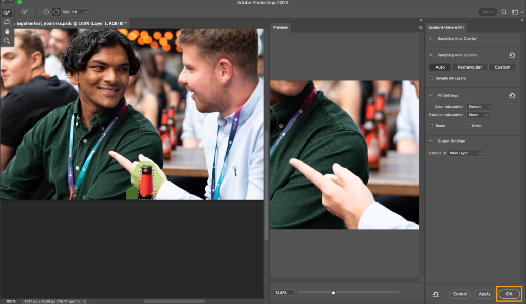
Then you have to use the brush tool to highlight where you want Photoshop to reference.
Then you click ‘apply’.
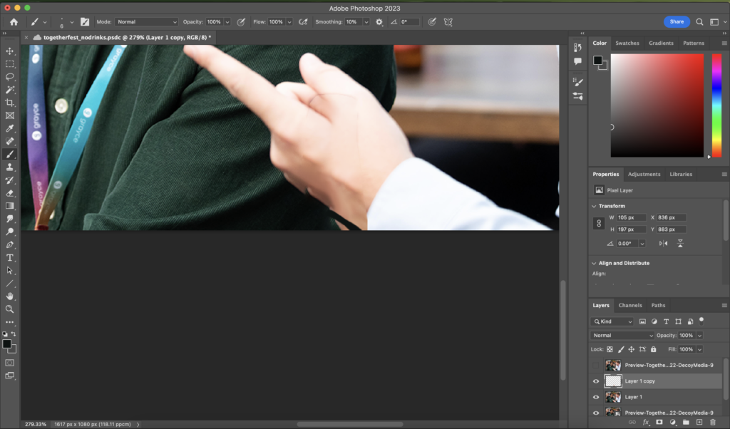
This can contain a lot of trial and error, but once you have something that gives you a rough idea of what you are going for, you go in with the brush tool to ease in the edit with the surrounding colours so that it isn’t obvious that you have taken out an object.
Here is the before and after!
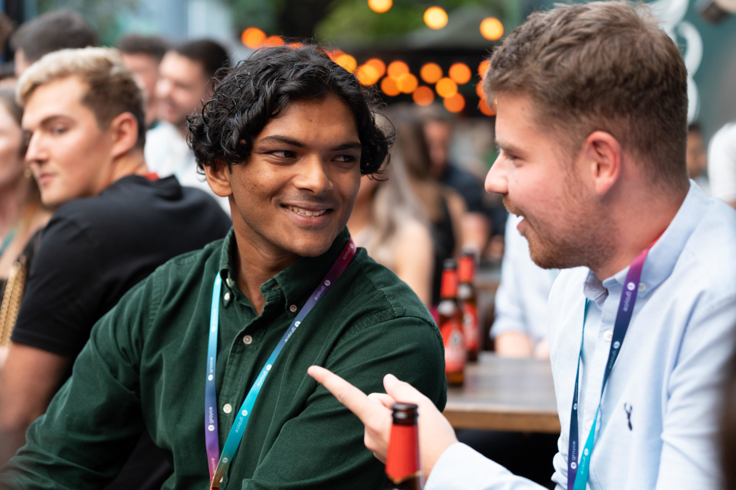
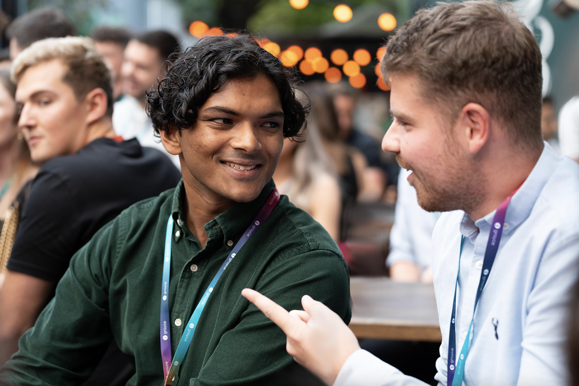
Doing these different edits was only a part of the process of changing the images. I also had to fiddle with the different saturation levels and overlay colours so that they didn’t look dull on the website. It also helps to look at the potential images on different screens so that you don’t go all out on an edit, only to see that it’s too saturated. For the multiple photos, I had to put them into shapes in Illustrator. In our branding, we never just use circles or squares, instead, we use a shape class called ‘lozenges’, which look like a wonky combination of a square and a circle.
To put your chosen image into a created shape, all you have to do once your shape is created is to go into the ‘File’ and click ‘Place’ which will open up your folder. Once your image is in place, make sure that the image is behind the shape and is fitted to the area where you want the shape to encompass, select both and click on ‘Create Clipping Mask’ and the navigation bar on the side, under ‘Quick Actions’.
I had to do this only for the images that were between the two banners because WordPress crops your image for you when you put it into the banner.
Once I was finished, I went through each page with my manager to make sure that she was happy with each one. There were a few that needed changing, but other than that the end result was approved. One of my teammates messaged me to ask for a list of the photos that I used for the website so that she didn’t duplicate them if she wanted to create another page or blog. So I created this Word document with the screenshot of the page with the corresponding image that I used for each one.
In the end, I was quite happy with the result and I got back a lot of positive feedback from the team. So far, our pageviews and sessions have started to go up. Going through this progress allowed me to understand what images work well for certain contexts, for example for the Community page, I knew that the images would have to show what we are like as a community.